
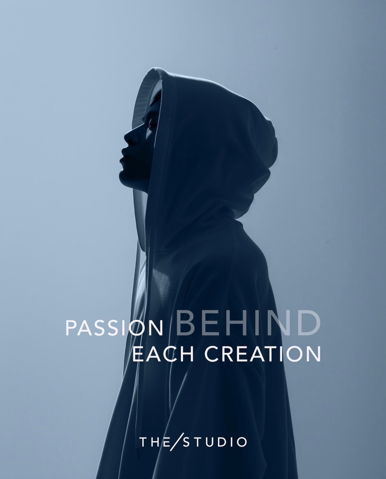
Brand guidelines
Consistency builds trust. Every word, image, and interaction shapes how people experience THE/STUDIO. These standards align our teams and channels, making sure we always express the brand clearly and intentionally.
THE/STUDIO stands for culture, creativity, and dependable manufacturing. Our identity should reflect that promise, whether we’re building a landing page, writing an email, or launching a new feature.
This is a shared system for expressing who we are with precision and purpose. And above all, we must remember that we are building this product for the customer. When in doubt, we choose what creates the best possible experience for them.
Contents
01
Brand basics
1a
Positioning
From idea to iconic is not just our promise. It’s how we help brands bring meaningful products to life.
THE/STUDIO is reshaping how products are made. Our platform makes custom manufacåturing accessible, hands on, and built to support every step of the journey. We combine global factory access, intuitive technology, and dedicated support to help businesses design and produce high quality goods with confidence.

We combine global factory access, intuitive technology, and dedicated support to help businesses design and produce high quality goods with confidence. Whether launching a new brand or scaling a global one, we exist to inspire our customers to make beautiful products. Everything is crafted with intention and made to reflect what their brand stands for.
Our platform helps customers in three key ways:
- Discover design inspiration or turn an idea into a production ready concept
- Match with trusted factories that bring their vision to life with ease
- Explore production methods and materials through a virtual trade show experience
We serve brand founders, designers, marketers, and sourcing teams who want to stand out, engage their communities, and grow with a supply chain that moves at the speed of culture.
We believe that great products come not just from design, but from care at every step. That means knowing where things are made, how they’re made, and ensuring each product reflects the values of the brand behind it.
1b
Mission
Unite the world’s top factories, designers, and creators and obsess over their success to build a supply chain that works for everyone.
1c
Vision
Build the world’s most powerful platform for custom product creation, so anyone, anywhere, can design and manufacture iconic products
1d
Core values
ものづくり
We live by the principle of monozukuri, which means making things with heart, craft, and continual refinement. Every interaction is an opportunity to improve, not only the product, but the process and the relationship behind it.
Stories before systems
We do not just fulfill orders. We work with people who are building brands, shaping identities, and chasing creative visions. From the first uploaded sketch to the final product in hand, we help inspire beautiful products and bring them to life.
Factory as a partner
Great products come from strong relationships. Our customers are not assigned to a random supplier. They gain access to trusted factories that care deeply about the outcome. The responsibility is shared. The success is mutual.
Care you can feel
In a world of shortcuts, we focus on getting it right. Every product should hold up, feel right in the hand, and show the care our customers put into their brands. Quality is not extra. It is the standard.
Tea with the factory
Most people never visit a factory, but the experience should still feel personal. We design every touchpoint to carry the same trust and warmth as sitting down for tea with the people who bring your product to life.
Customer-centric innovation
Our ideas grow from real conversations with the brands we serve. We design tools and experiences around their challenges, always improving with them and staying grounded in what they truly need.
1e
Market differentiators
One platform
We unify sourcing, customization, production, and logistics so teams can work in one place without managing multiple partners.
Product forward
We help brands show what they make through real examples, strong visuals, and case studies that build trust.
Guaranteed quality
Every order is reviewed before it ships. We stand behind the work.
Reliable timelines
We work closely with production partners to deliver on time and with consistency.
Product forward
We help brands show what they make through real examples, strong visuals, and case studies that build trust.
Scalable on demand
Brands can test ideas and grow at their pace without committing to high volumes or rigid workflows.
1f
Target audience
We serve people who are building something that matters. For them, every decision reflects their story, values, and identity.
Our customers include entrepreneurs launching lifestyle lines, designers turning ideas into physical products, and e-commerce founders ready to move beyond print on demand. We support marketing teams using merchandise to shape culture and community, as well as sourcing and production leads at larger companies who need a curated and agile supply chain that lets them test ideas faster with smaller MOQs.
What they seek is creation with intention and staying true to what their brand stands for.
1g
Brand story
THE/STUDIO began with a simple request and a shift in perspective.
It started with one small patch order, made for a friend. What followed was not a business idea, but a realization. Behind every product was a person. Behind every order was a story. These were not just transactions. They were expressions of identity, belief, and purpose.
We imagined a future where anyone could create something meaningful without needing scale or connections. A world where the path from idea to product felt thoughtful, not transactional. Where people could work with makers who understood what they were trying to build.
That vision became THE/STUDIO. A platform built for brands that care about what they make and who they make it with.
02
Visual identity
Visual identity is how the brand presents itself. It brings consistency, clarity, and recognition across every touchpoint. Each element plays a role, but together they form a unified system that reflects our values, tone, and personality.
This section defines how to apply the visual elements of THE/STUDIO so the brand feels cohesive and unmistakable across product, platform, and communication.
2a
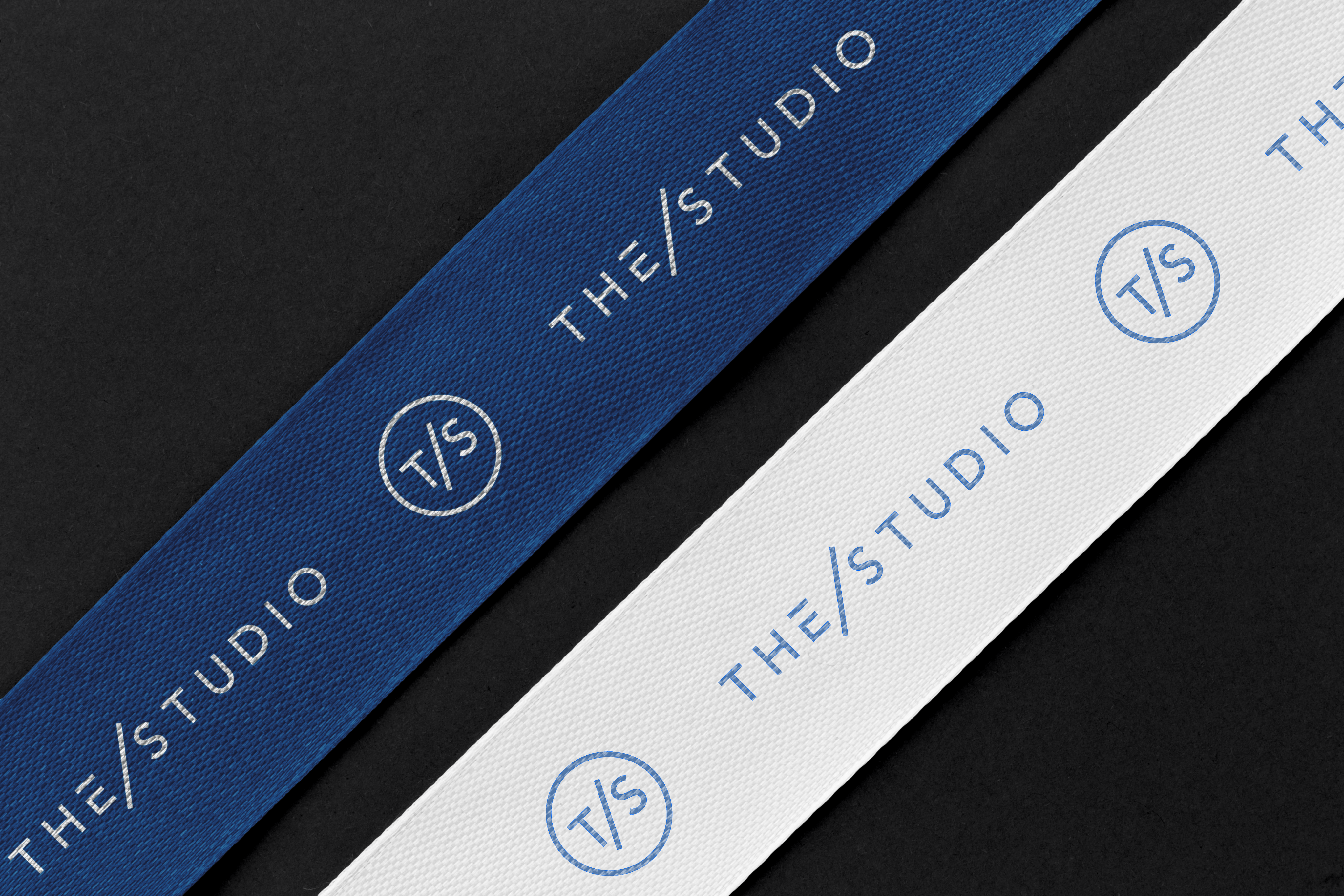
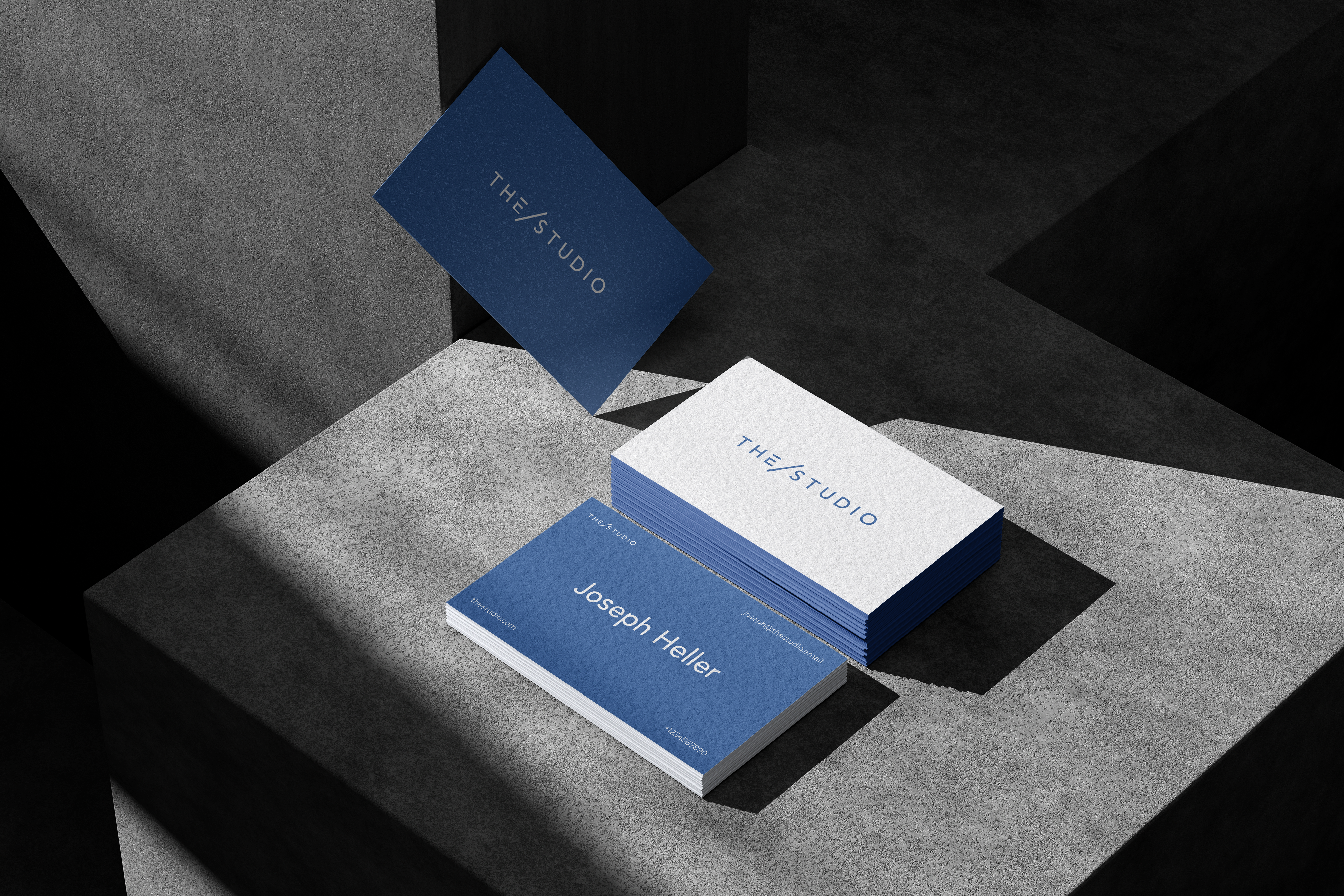
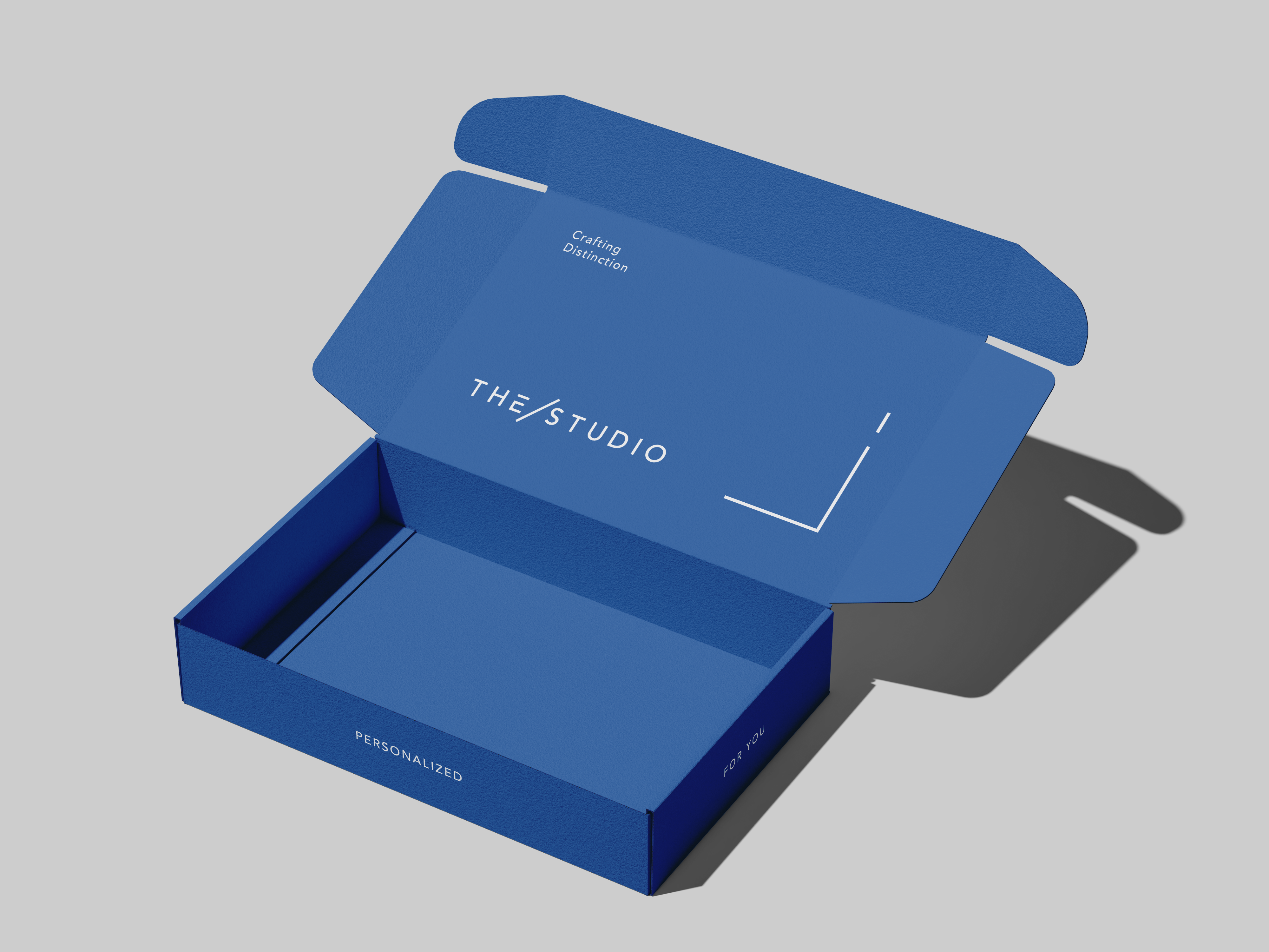
Logo
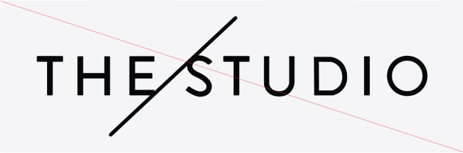
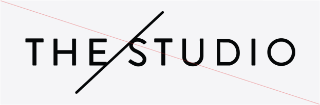
Our logo reflects the transformation of ideas into thoughtful products. Its minimalist design stands for clarity, precision, and purpose.
The customized E signals flexibility and attention to detail. It shows our commitment to creating tailored experiences for every client.
The slash represents the journey from concept to finished product. It captures our role as a partner throughout the process.
Together, these elements form a mark of trust, creativity, and care.

Logo clearspace


2b
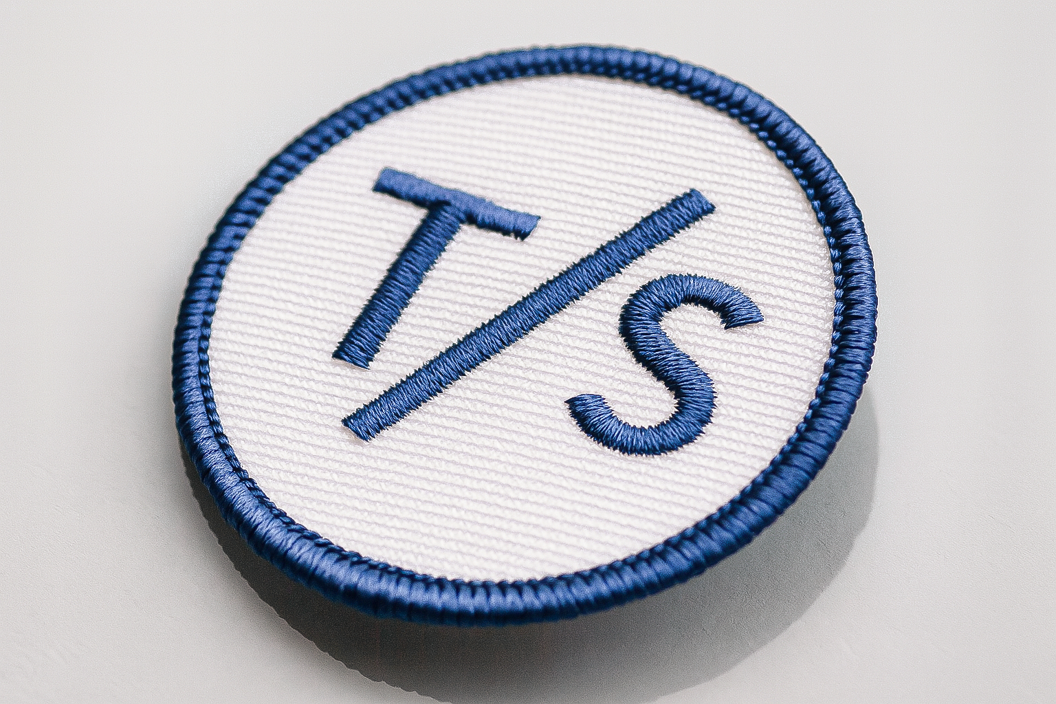
Sign
The sign, with its T and S enclosed in a circle and divided by a diagonal slash, serves as a stamp of quality. It represents our commitment to precision, tailored solutions, and the blend of traditional craftsmanship with modern digital manufacturing.

Sign clearspace

2c
Usage
In communication, the logo should be either prominently displayed or subtly integrated, depending on whether it plays a leading or supporting role. Always follow clear space and minimum size guidelines to maintain consistency and recognition.
The T/S sign is a key part of our visual identity but should not replace the primary logo. It works best as a supporting element, used alongside the main logo to strengthen brand presence. Use the sign on packaging, digital assets, or marketing materials where the primary mark is already in view.
In communication, the logo should be either clearly visible or subtly integrated, depending on its role. Always respect clear space to maintain consistency and brand recognition.
2d
Common misuses


Distortion

Off-brand colors
Old versions

Stroke

Adding effects

Modified components

Poor contrast

Lack of clear space

Decorative elements
2e
Color palette
Our primary color palette is curated to express modern clarity and sophistication. THE/BLUE conveys calm, confidence, and professionalism, reinforcing a sense of trust. The light gray provides a clean, almost weightless backdrop that aligns with our minimalist aesthetic. The deep gray anchors the system, adding balance and strength across a wide range of design applications.
The secondary palette is reserved for specific functions like calls to action or interactive elements. It should not be broadly used in layouts, backgrounds, or brand-led visuals. When in doubt, rely on the primary palette to maintain consistency.
- Primary palette
THE/BLUE
Hex: #2D5D9F
Pantone P 104-15 C
Light gray
Hex: #F5F5F7
Pantone P 179-2 C
Deep gray
Hex: #2D2D2D
Pantone P 179-15 C
- Secondary palette
Green
Hex: #11A66A
Signal Red
Hex: #E33232
Electric Pink
Hex: #E7347F
Vivid Violet
Hex: #AB31DC
- Gradients
Use gradients to suggest motion, depth, and emotion. They hint at action and almost divine intelligence behind the system. Stick to smooth blends of approved brand colors. Avoid harsh contrast or complex effects.
Gredients palette
Green
Hex: #11A66A
Signal Red Gradient
Hex: #E33232
Electric Pink Gradient
Hex: #E7347F
Vivid Violet Gradient
Hex: #AB31DC
Green
Hex: #11A66A
2f
Typography
Our typography balances clarity with character. It is designed to support functional communication and expressive storytelling across all brand touchpoints.

Figtree is our primary display typeface. It is modern, confident, and character-driven. Use Figtree for headlines, large titles, and expressive moments where brand personality should lead.
Montserrat is our secondary typeface. Its geometric structure and clean rhythm make it ideal for longer text, user interfaces, and everyday communication. Use Montserrat for paragraphs, labels, and anytime when readability is essential.
Together, these typefaces create a system that feels both elevated and approachable, consistent across print and digital environments.
- Primary typeface
Design with purpose
- Secondary typeface
Custom products made simple, from idea to delivery.
03
Visual identity
In communication, the logo should be either prominently displayed or subtly integrated, depending on whether it plays a leading or supporting role. Always follow clear space and minimum size guidelines to maintain consistency and recognition.

This section defines the tone we use, the principles that guide our writing, and the rules that ensure consistency in how we present our brand through language. From capitalization and product naming to how we refer to THE/STUDIO, these guidelines help us communicate with precision, purpose, and personality.
3a
Tone of voice
Be clear
Say what you mean. Avoid jargon, clutter, or clever phrasing that gets in the way of understanding.
Be a human
Write like a real person. Avoid robotic language or empty sales talk. Keep it genuine, helpful, and easy to follow.
Be excited
The customer is building something they care about. Match their energy. Let your passion for great products come through.
Be an expert
You know the process better than they do. Guide them with clarity and confidence, making it easier to move forward.
Be thoughtful
Keep it polished and structured. Grammar, tone, and formatting matter. Even short replies should feel complete and respectful.
Be warm
Sound approachable without being too casual. Avoid greetings like “Hi there” or overly conversational openers. Respect the reader’s time while showing care and thoughtfulness in every message.
Be celebratory
Make the customer the hero in their custom manufacturing journey. Mark the wins. Approving a sample, reaching a milestone, completing a step. It builds momentum and makes the journey meaningful.
3b
Capitalization
Use sentence case for all headlines. Capitalize only the first word, proper nouns, product names, distinct features, and key selling points. Terms like Embroidered Patches, Metallic Threads, Low Minimums should appear with capital letters. Avoid using title case unless required in legal or formal contexts
Some titles or short phrases may be fully capitalized when clarity, emphasis, or hierarchy calls for it. This should be used sparingly and only when it strengthens the message or improves readability.
3c
Brand name usage

THE/STUDIO brand name must always appear in all capital letters, regardless of context or format. This rule applies across all external communication, including headlines, body copy, user interfaces, and internal documents. Do not use lowercase or abbreviations. Maintaining this format reinforces brand recognition and consistency.Some titles or short phrases may be fully capitalized when clarity, emphasis, or hierarchy calls for it. This should be used sparingly and only when it strengthens the message or improves readability.
3d
Copy examples
Website hero
Make what matters.
Create custom products through a platform designed for clarity, care, and control from start to finish.
Product description
Made to move.
Custom embroidered patches are made to last. With rich detail and vibrant texture, they add character to any product.
Email intro
Hello Jane,
Just checking in to see if you had a chance to review your quote. We’re here if you have any questions or need help moving forward with your order.
Error message
Something went wrong
We’re already looking into the issue on our end. If you continue to experience problems, please let us know and we’ll make sure it gets resolved.
Empty cart
Still deciding?
It looks like your cart is empty. When you’re ready, we’ll be here to help you move forward and turn your custom product into something real.
Checkout confirmation
Order received
Thank you for creating with THE/STUDIO. Your order is in production and we’ll keep you updated at each step along the way.
04
Visual identity
In communication, the logo should be either prominently displayed or subtly integrated, depending on whether it plays a leading or supporting role. Always follow clear space and minimum size guidelines to maintain consistency and recognition.
4a
Digital presence
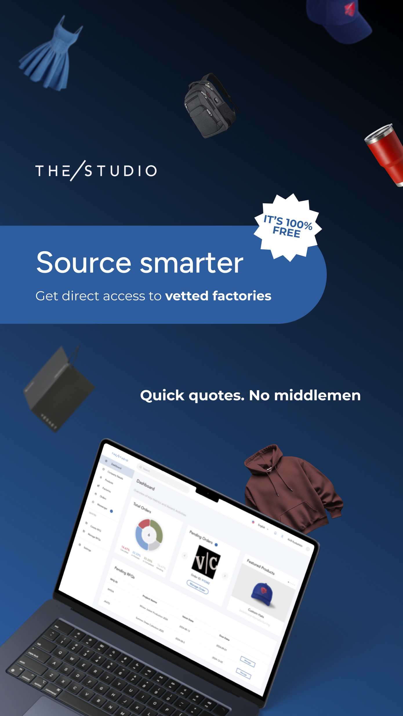
Our digital presence should reflect the same clarity, quality, and personality found across every touchpoint of THE/STUDIO brand. From website to email, every element should feel consistent and intentional. Use clear layouts, legible typography, balanced spacing, and an intuitive visual flow. Maintain our tone of voice in all headlines and body copy, and ensure product visuals follow photography principles. Always prioritize usability, speed, and simplicity in design.
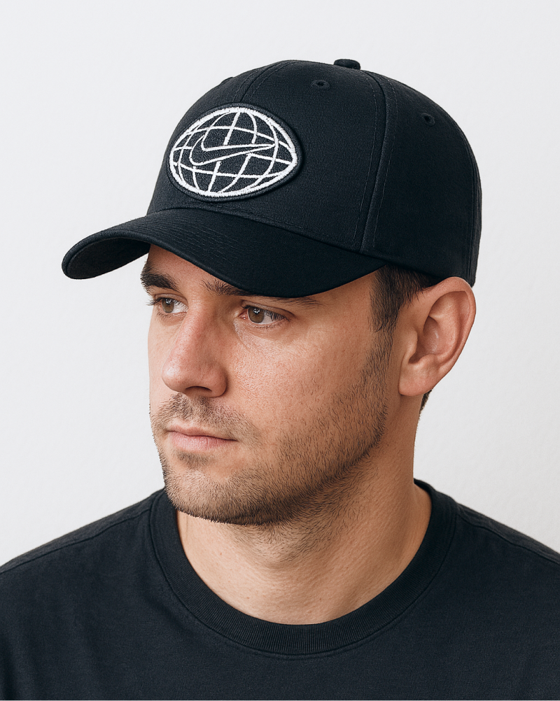
Nike x THE/STUDIO
View full story
PATCHES
Use clear layouts, legible typography, balanced spacing, and an intuitive visual flow. Maintain our tone of voice in all headlines and body copy, and ensure product visuals follow photography principles. Always prioritize usability, speed, and simplicity in design.
4b
Product photography
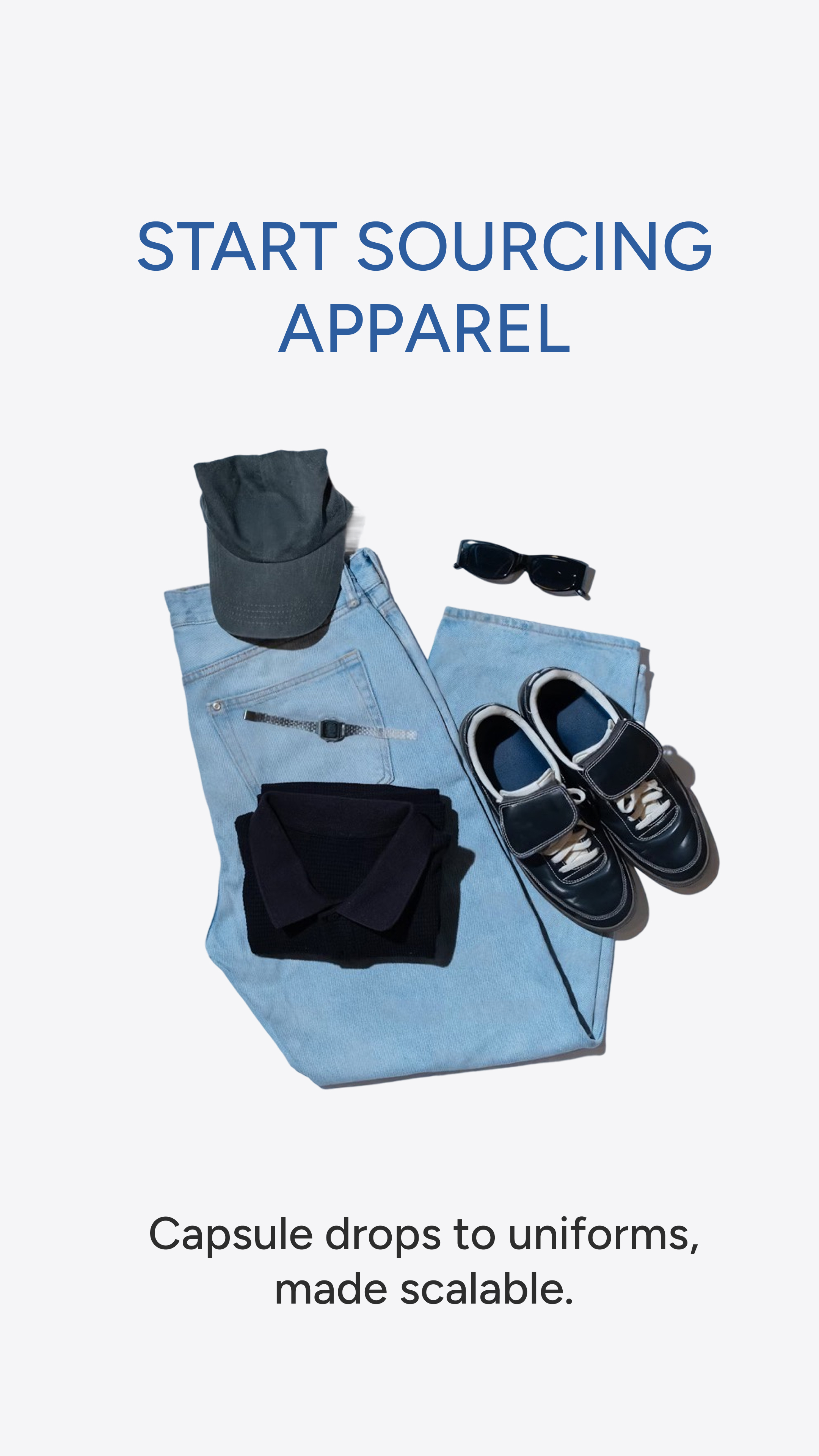
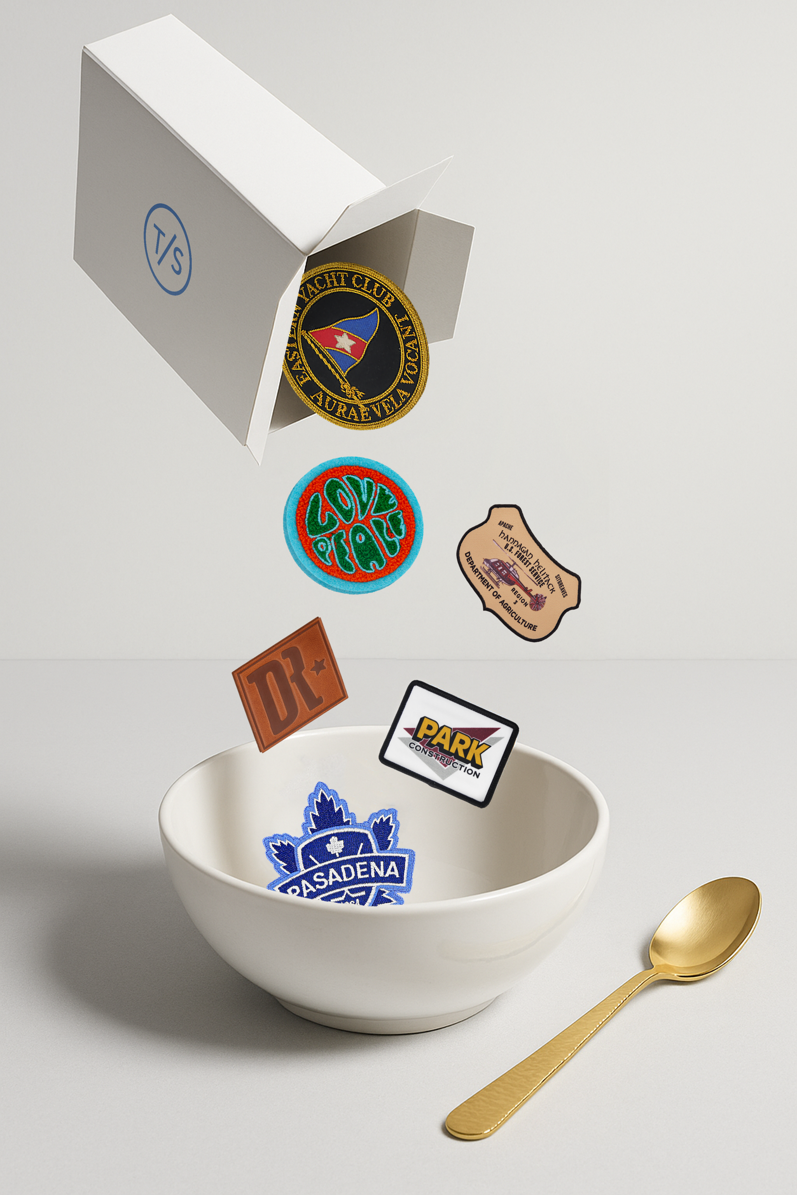
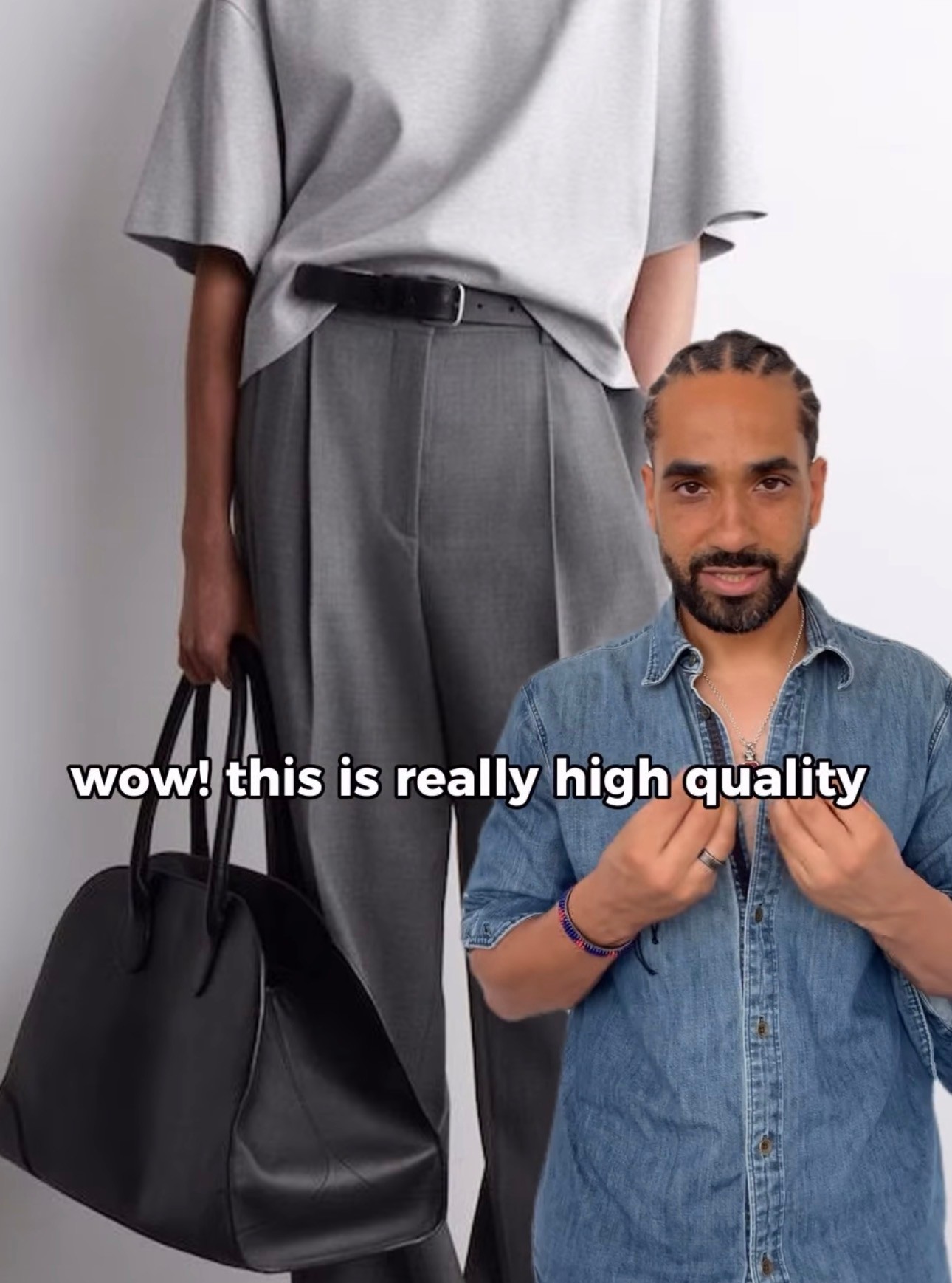
Photography is one of the clearest reflections of our quality. Provide a complete set of images for each product, including front and back views, angled shots, and closeups that highlight detail and texture. Ensure every photo is high resolution, well lit, and retouched with care. Backgrounds must be clean and distraction-free. Center objects consistently across the series. Group similar products where relevant to strengthen visual storytelling and collection cohesion.

4c
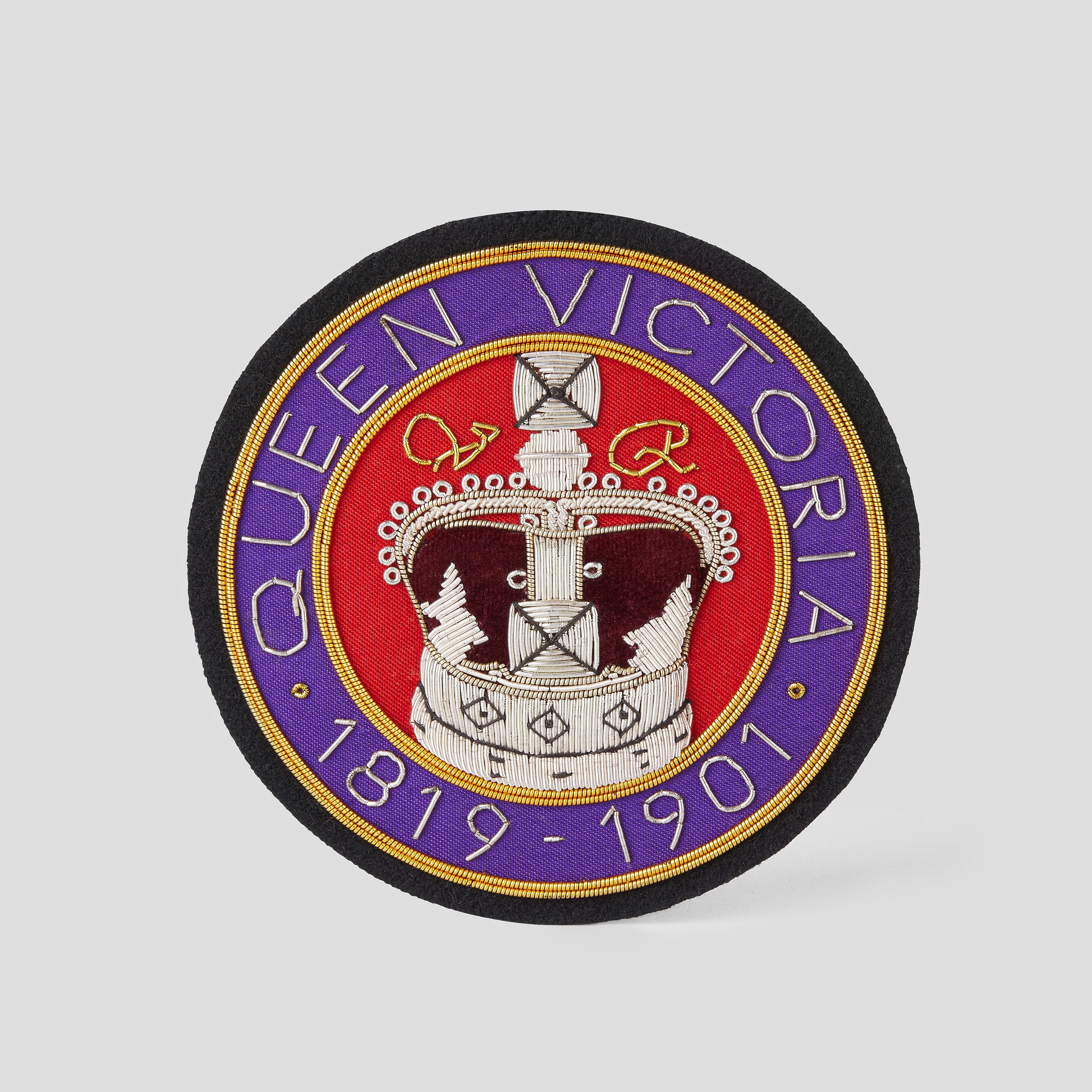
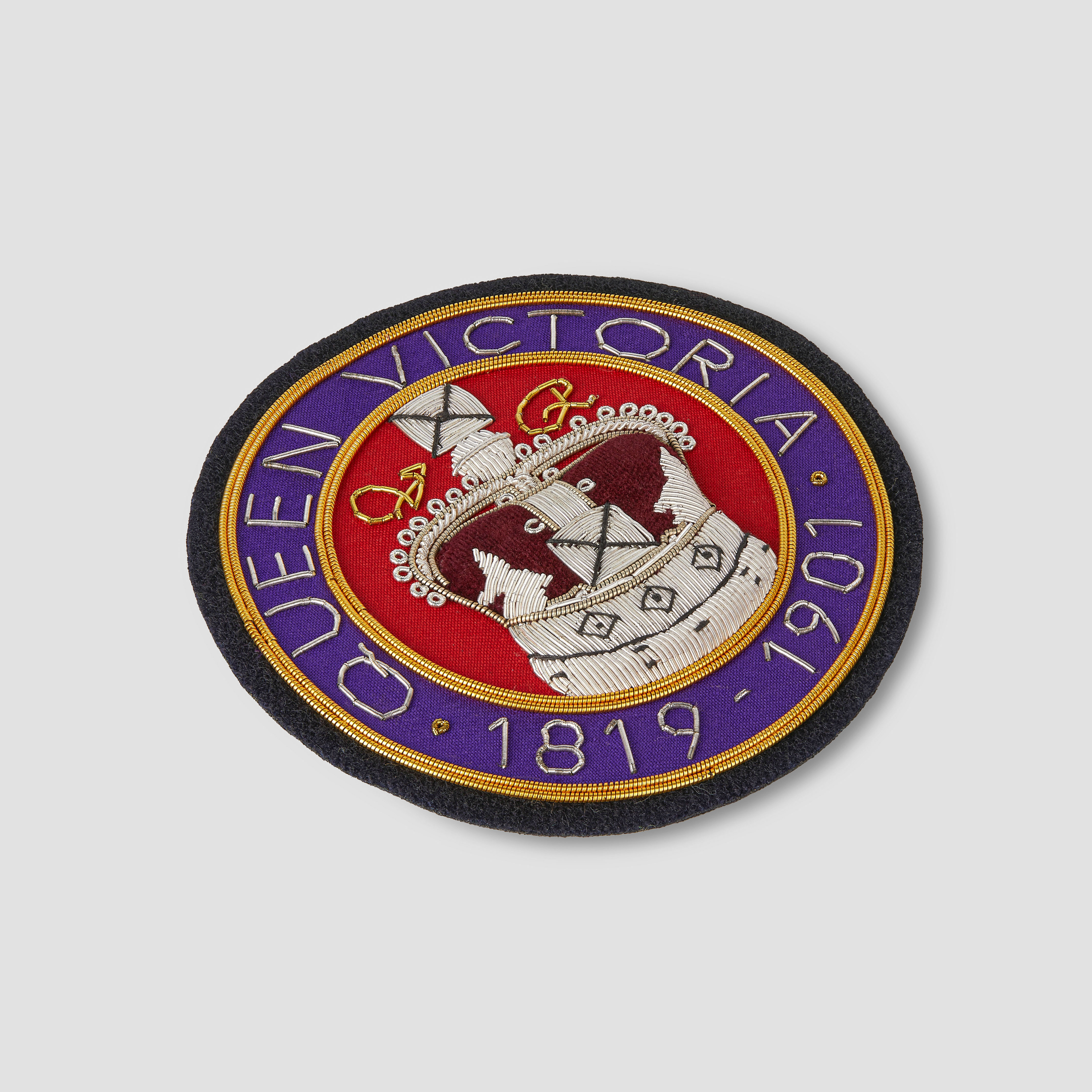
Retouching
Retouching should enhance the product without misrepresenting it. Clean up minor imperfections, adjust lighting and color for accuracy, and ensure consistency across all images. Avoid over-editing or artificial effects. The goal is to present each product in its best light while staying true to how it appears in real life.

Original

Retouched
4d
Ads creatives
Ad visuals should be product-led, clear, and immediately recognizable as THE/STUDIO. Focus on high-quality product imagery, simple layouts, and concise messaging. Maintain consistent use of color, typography, and logo placement. Creatives must load quickly, look clean on any screen, and communicate value without relying on heavy effects or overly promotional language. Prioritize clarity, impact, and brand cohesion across formats.
4e
Social media
Our social voice is clear, confident, and human. We speak from experience but stay approachable, focused on craft and our clients’ stories. We speak from experience, but never from a pedestal. The tone is expert yet warm, modern but never forced, and always rooted in care for detail and quality. When appropriate, we allow subtle humor to keep things relatable and engaging. We aim to inspire, inform, and connect with brands building meaningful products.
Visual storytelling
Every post should instantly show its purpose, whether it’s a product, process, or client success. Keep visuals clear, polished, and on-brand.
Text on images
Use text sparingly and only when it adds value. Keep it bold, readable, and styled with our brand fonts and colors. Maintain balance in the grid. Too many text-heavy posts make the feed feel crowded.
Captions
Be brief, real, and direct. Say what matters. Avoid fluff, robotic phrasing, and generic greetings. Every caption should sound thoughtful and written by a person.

CEO insights
Bite-sized advice from Joseph Heller on manufacturing, supply chains, and the future of custom. Visuals: Video clips, key quotes, industry graphics.

Trend and design
What’s trending in custom products and design. Get inspired for your next creation.
Visuals: Mood boards, trend collages, product examples.

Crafted with care
Behind-the-scenes glimpses of our factories, materials, and detailed craftsmanship.
Visuals: Manufacturing clips, materials, product details.

Client stories
Real brand success stories with unboxing moments and custom products in action.
Visuals: UGC videos, product shots, quick testimonials.
Sourcing
A look at how our platform streamlines sourcing, customization, and logistics.
Visuals: Screen recordings, 5-step explainers, benefit icons.
4f
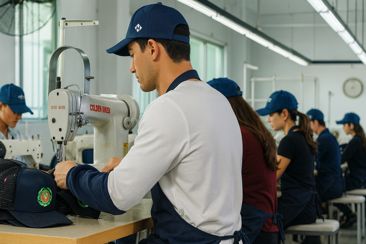
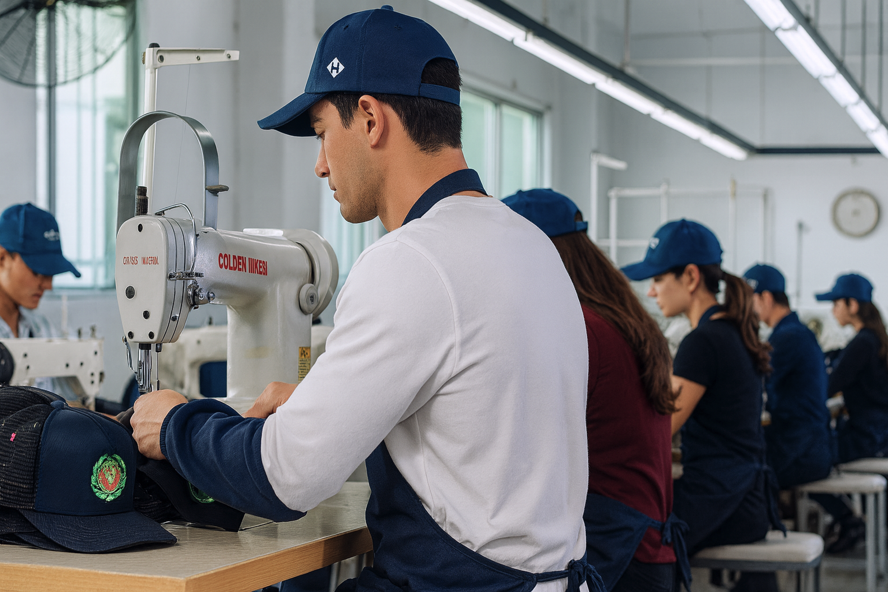
Factory storytelling
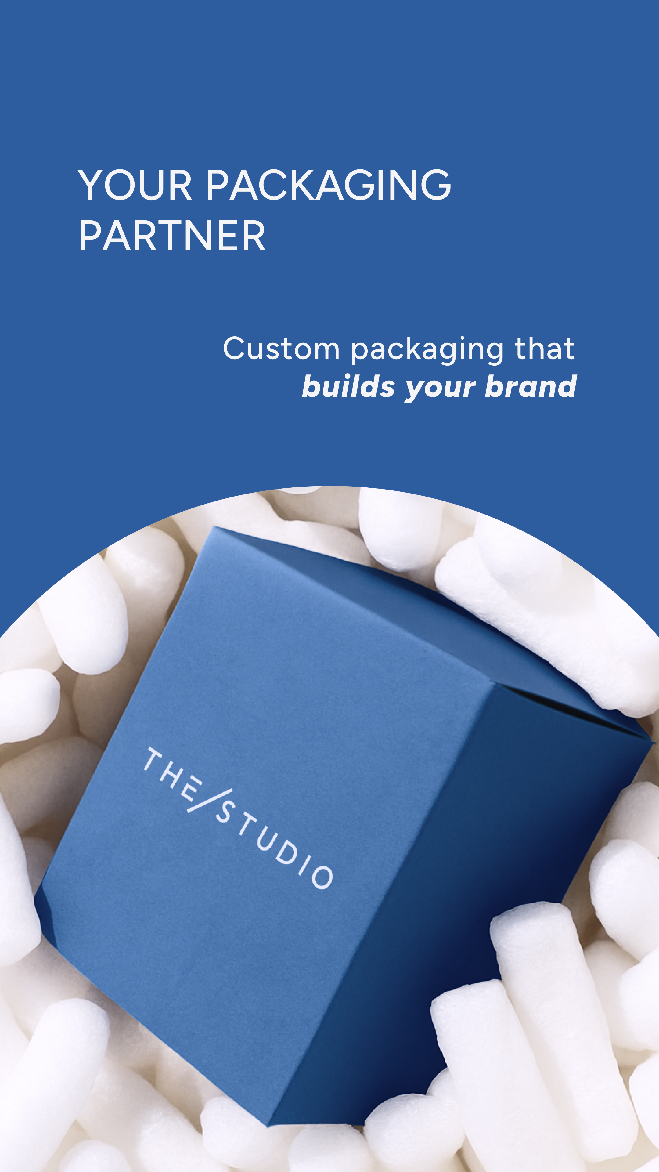
Our factories are not just part of the process, they are part of the story. Showcasing where and how our products are made honors the craft, builds transparency, and makes our platform stand out.
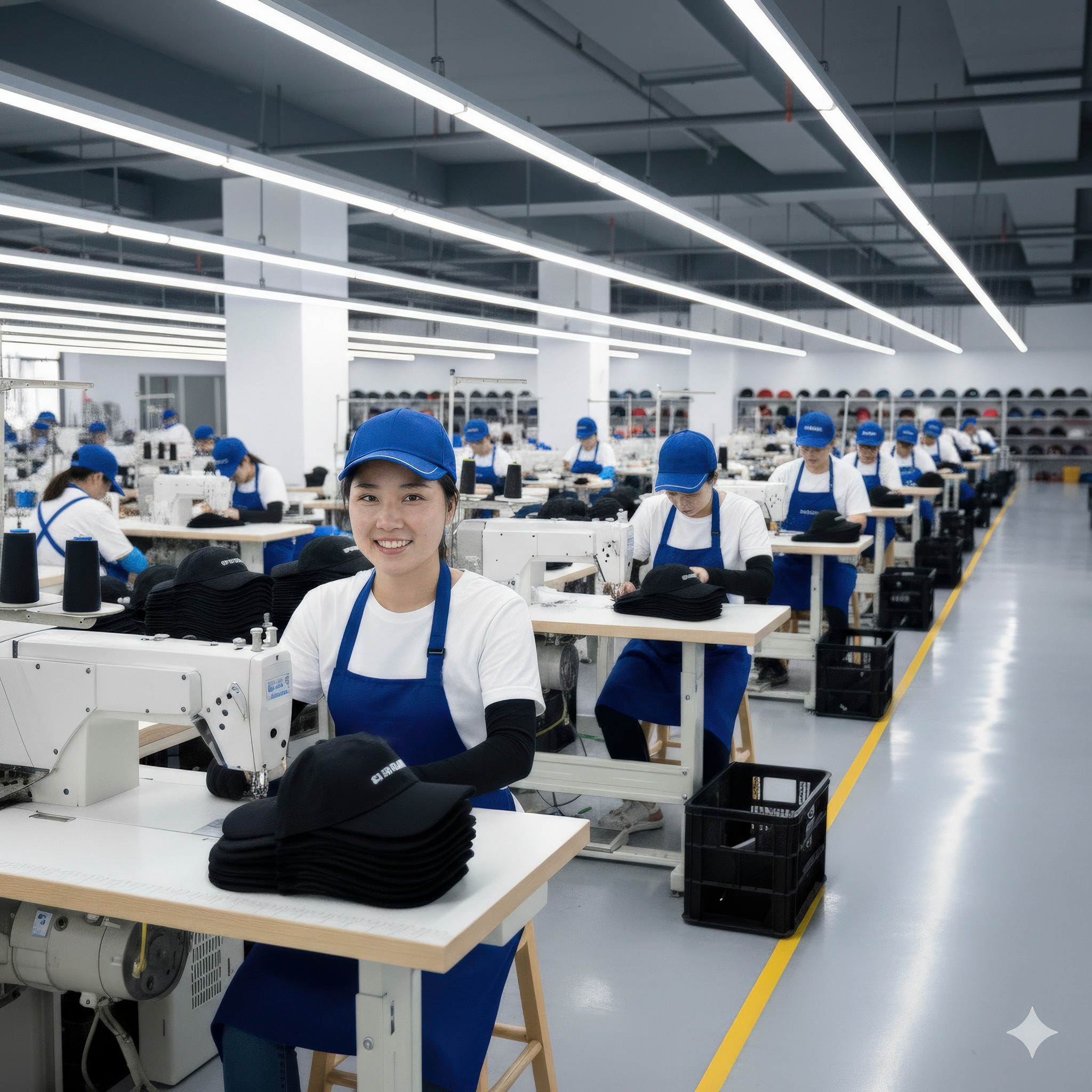
Use behind-the-scenes photos, short videos, and glimpses into real production environments to highlight the care and expertise involved. Include these visuals across the website, emails, and case studies when possible.
Factory content should feel respectful, well-composed, and authentic. Prioritize clarity, quality, and consistency with the rest of our brand.
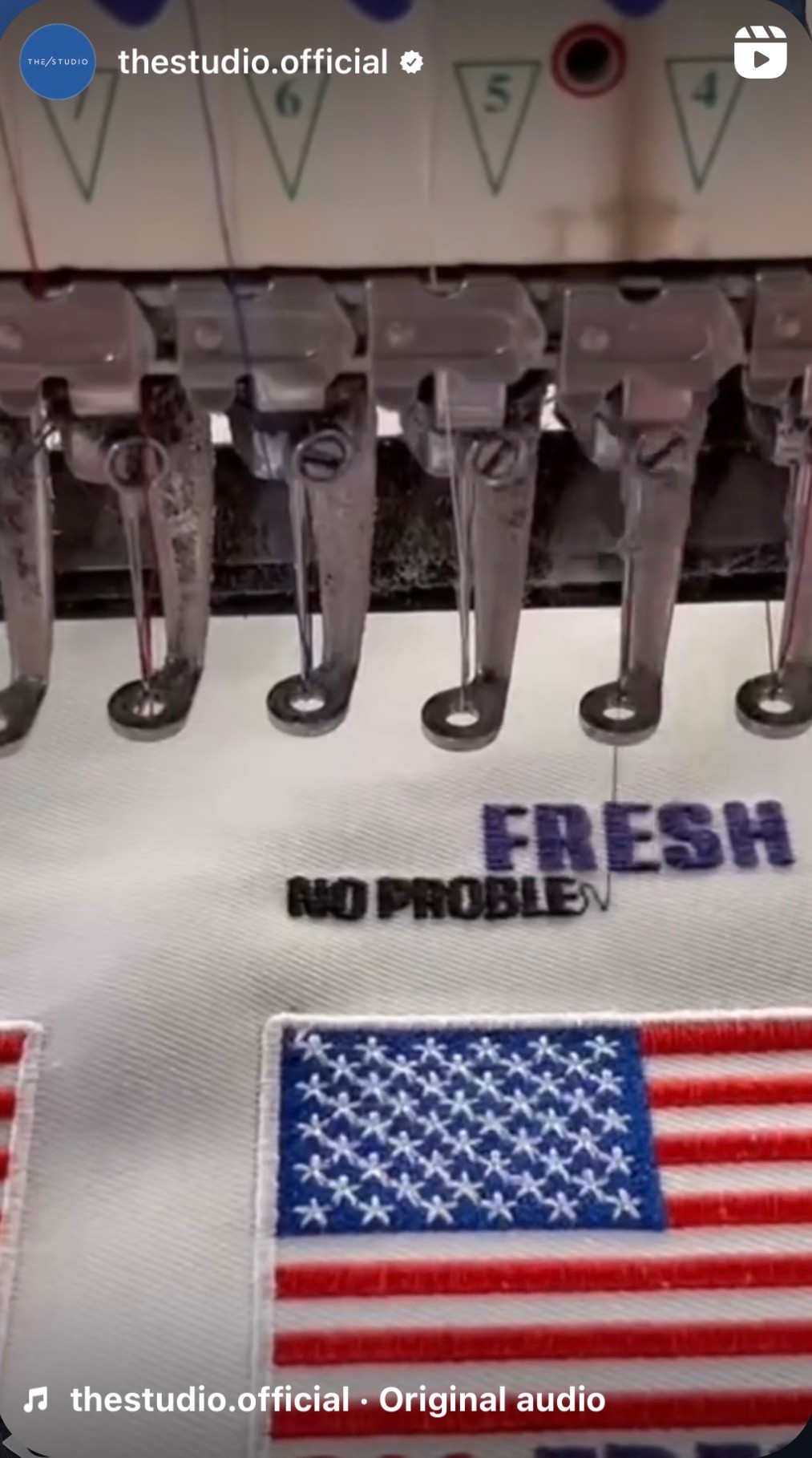
Video is especially powerful. Short clips of manufacturing steps, packaging moments, or factory walkthroughs can turn a product page into a story and build trust at every step.
05
Downloads
Access ready-to-use brand assets in one place. This section includes logos and the brand sign in both vector and raster formats, approved fonts, and a folder of product and brand photography for consistent use across all media.


Brand guidelines
Consistency builds trust. Every word, image, and interaction shapes how people experience THE/STUDIO. These standards align our teams and channels, making sure we always express the brand clearly and intentionally.
THE/STUDIO stands for culture, creativity, and dependable manufacturing. Our identity should reflect that promise, whether we’re building a landing page, writing an email, or launching a new feature.
This is a shared system for expressing who we are with precision and purpose. And above all, we must remember that we are building this product for the customer. When in doubt, we choose what creates the best possible experience for them.
Contents
01
Brand basics
1a
Positioning
From idea to iconic is not just our promise. It’s how we help brands bring meaningful products to life.
THE/STUDIO is reshaping how products are made. Our platform makes custom manufacturing accessible, hands on, and built to support every step of the journey. We combine global factory access, intuitive technology, and dedicated support to help businesses design and produce high quality goods with confidence.
We combine global factory access, intuitive technology, and dedicated support to help businesses design and produce high quality goods with confidence. Whether launching a new brand or scaling a global one, we exist to inspire our customers to make beautiful products. Everything is crafted with intention and made to reflect what their brand stands for.
Our platform helps customers in three key ways:
- Discover design inspiration or turn an idea into a production ready concept
- Match with trusted factories that bring their vision to life with ease
- Explore production methods and materials through a virtual trade show experience
We serve brand founders, designers, marketers, and sourcing teams who want to stand out, engage their communities, and grow with a supply chain that moves at the speed of culture.
We believe that great products come not just from design, but from care at every step. That means knowing where things are made, how they’re made, and ensuring each product reflects the values of the brand behind it.
1b
Mission
Unite the world’s top factories, designers, and creators and obsess over their success to build a supply chain that works for everyone.
1c
Vision
Build the world’s most powerful platform for custom product creation, so anyone, anywhere, can design and manufacture iconic products
1d
Core values
ものづくり
We live by the principle of monozukuri, which means making things with heart, craft, and continual refinement. Every interaction is an opportunity to improve, not only the product, but the process and the relationship behind it.
Stories before systems
We do not just fulfill orders. We work with people who are building brands, shaping identities, and chasing creative visions. From the first uploaded sketch to the final product in hand, we help inspire beautiful products and bring them to life.
Factory as a partner
Great products come from strong relationships. Our customers are not assigned to a random supplier. They gain access to trusted factories that care deeply about the outcome. The responsibility is shared. The success is mutual.
Care you can feel
In a world of shortcuts, we focus on getting it right. Every product should hold up, feel right in the hand, and show the care our customers put into their brands. Quality is not extra. It is the standard.
Tea with the factory
Most people never visit a factory, but the experience should still feel personal. We design every touchpoint to carry the same trust and warmth as sitting down for tea with the people who bring your product to life.
Customer-centric innovation
Our ideas grow from real conversations with the brands we serve. We design tools and experiences around their challenges, always improving with them and staying grounded in what they truly need.
1e
Market differentiators
One platform
We unify sourcing, customization, production, and logistics so teams can work in one place without managing multiple partners.
Trusted factories
Every factory is vetted, managed, and held to our standards. We do not list vendors. We partner with makers.
Product forward
We help brands show what they make through real examples, strong visuals, and case studies that build trust.
Scalable on demand
We take service personally. From onboarding to delivery, our team offers fast answers, real guidance, and proactive care.
Guaranteed quality
Every order is reviewed before it ships. We stand behind the work.
Reliable timelines
We work closely with production partners to deliver on time and with consistency.
1f
Target audience
We serve people who are building something that matters. For them, every decision reflects their story, values, and identity.
Our customers include entrepreneurs launching lifestyle lines, designers turning ideas into physical products, and e-commerce founders ready to move beyond print on demand. We support marketing teams using merchandise to shape culture and community, as well as sourcing and production leads at larger companies who need a curated and agile supply chain that lets them test ideas faster with smaller MOQs.
What they seek is creation with intention and staying true to what their brand stands for.
1g
Brand story
THE/STUDIO began with a simple request and a shift in perspective.
It started with one small patch order, made for a friend. What followed was not a business idea, but a realization. Behind every product was a person. Behind every order was a story. These were not just transactions. They were expressions of identity, belief, and purpose.
We imagined a future where anyone could create something meaningful without needing scale or connections. A world where the path from idea to product felt thoughtful, not transactional. Where people could work with makers who understood what they were trying to build.
That vision became THE/STUDIO. A platform built for brands that care about what they make and who they make it with.
02
Visual identity
Visual identity is how the brand presents itself. It brings consistency, clarity, and recognition across every touchpoint. Each element plays a role, but together they form a unified system that reflects our values, tone, and personality.
This section defines how to apply the visual elements of THE/STUDIO so the brand feels cohesive and unmistakable across product, platform, and communication.
2a
Logo
Our logo reflects the transformation of ideas into thoughtful products. Its minimalist design stands for clarity, precision, and purpose.
The customized E signals flexibility and attention to detail. It shows our commitment to creating tailored experiences for every client.
The slash represents the journey from concept to finished product. It captures our role as a partner throughout the process.
Together, these elements form a mark of trust, creativity, and care.

Logo clearspace

2b
Sign
The sign, with its T and S enclosed in a circle and divided by a diagonal slash, serves as a stamp of quality. It represents our commitment to precision, tailored solutions, and the blend of traditional craftsmanship with modern digital manufacturing.

Sign clearspace

2c
Usage
In communication, the logo should be either prominently displayed or subtly integrated, depending on whether it plays a leading or supporting role. Always follow clear space and minimum size guidelines to maintain consistency and recognition.
The T/S sign is a key part of our visual identity but should not replace the primary logo. It works best as a supporting element, used alongside the main logo to strengthen brand presence. Use the sign on packaging, digital assets, or marketing materials where the primary mark is already in view.
In communication, the logo should be either clearly visible or subtly integrated, depending on its role. Always respect clear space to maintain consistency and brand recognition.
2d
Common misuses

Distortion

Off-brand colors
Old versions

Stroke

Adding effects

Modified components

Poor contrast

Lack of clear space

Decorative elements
2e
Color palette
Our primary color palette is curated to express modern clarity and sophistication. THE/BLUE conveys calm, confidence, and professionalism, reinforcing a sense of trust. The light gray provides a clean, almost weightless backdrop that aligns with our minimalist aesthetic. The deep gray anchors the system, adding balance and strength across a wide range of design applications.
The secondary palette is reserved for specific functions like calls to action or interactive elements. It should not be broadly used in layouts, backgrounds, or brand-led visuals. When in doubt, rely on the primary palette to maintain consistency.
- Primary palette
THE/BLUE
Hex: #2D5D9F
Pantone P 104-15 C
Light gray
Hex: #F5F5F7
Pantone P 179-2 C
Deep gray
Hex: #2D2D2D
Pantone P 179-15 C
- Secondary palette
Green
Hex: #11A66A
Signal Red
Hex: #E33232
Electric Pink
Hex: #E7347F
Vivid Violet
Hex: #AB31DC
- Gradients
Use gradients to suggest motion, depth, and emotion. They hint at action and almost divine intelligence behind the system. Stick to smooth blends of approved brand colors. Avoid harsh contrast or complex effects.
Gredients palette
Green
Hex: #11A66A
Green
Hex: #11A66A
Signal Red Gradient
Hex: #E33232
Electric Pink Gradient
Hex: #E7347F
Vivid Violet Gradient
Hex: #AB31DC
2f
Typography
Our typography balances clarity with character. It is designed to support functional communication and expressive storytelling across all brand touchpoints.

Figtree is our primary display typeface. It is modern, confident, and character-driven. Use Figtree for headlines, large titles, and expressive moments where brand personality should lead.
Montserrat is our secondary typeface. Its geometric structure and clean rhythm make it ideal for longer text, user interfaces, and everyday communication. Use Montserrat for paragraphs, labels, and anytime when readability is essential.
Together, these typefaces create a system that feels both elevated and approachable, consistent across print and digital environments.
- Primary typeface
Design with purpose
- Secondary typeface
Custom products made simple, from idea to delivery.
03
Voice and language
In communication, the logo should be either prominently displayed or subtly integrated, depending on whether it plays a leading or supporting role. Always follow clear space and minimum size guidelines to maintain consistency and recognition.
This section defines the tone we use, the principles that guide our writing, and the rules that ensure consistency in how we present our brand through language. From capitalization and product naming to how we refer to THE/STUDIO, these guidelines help us communicate with precision, purpose, and personality.
3a
Tone of voice
Be clear
Say what you mean. Avoid jargon, clutter, or clever phrasing that gets in the way of understanding.
Be a human
Write like a real person. Avoid robotic language or empty sales talk. Keep it genuine, helpful, and easy to follow.
Be excited
The customer is building something they care about. Match their energy. Let your passion for great products come through.
Be an expert
You know the process better than they do. Guide them with clarity and confidence, making it easier to move forward.
Be thoughtful
Keep it polished and structured. Grammar, tone, and formatting matter. Even short replies should feel complete and respectful.
Be warm
Sound approachable without being too casual. Avoid greetings like “Hi there” or overly conversational openers. Respect the reader’s time while showing care and thoughtfulness in every message.
Be celebratory
Make the customer the hero in their custom manufacturing journey. Mark the wins. Approving a sample, reaching a milestone, completing a step. It builds momentum and makes the journey meaningful.
3b
Capitalization
Use sentence case for all headlines. Capitalize only the first word, proper nouns, product names, distinct features, and key selling points. Terms like Embroidered Patches, Metallic Threads, Low Minimums should appear with capital letters. Avoid using title case unless required in legal or formal contexts
Some titles or short phrases may be fully capitalized when clarity, emphasis, or hierarchy calls for it. This should be used sparingly and only when it strengthens the message or improves readability.
3c
Brand name usage
THE/STUDIO brand name must always appear in all capital letters, regardless of context or format. This rule applies across all external communication, including headlines, body copy, user interfaces, and internal documents. Do not use lowercase or abbreviations. Maintaining this format reinforces brand recognition and consistency.Some titles or short phrases may be fully capitalized when clarity, emphasis, or hierarchy calls for it. This should be used sparingly and only when it strengthens the message or improves readability.
3d
Copy examples
Website hero
Make what matters.
Create custom products through a platform designed for clarity, care, and control from start to finish.
Product description
Made to move.
Custom embroidered patches are made to last. With rich detail and vibrant texture, they add character to any product.
Email intro
Hello Jane,
Just checking in to see if you had a chance to review your quote. We’re here if you have any questions or need help moving forward with your order.
Error message
Something went wrong
We’re already looking into the issue on our end. If you continue to experience problems, please let us know and we’ll make sure it gets resolved.
Empty cart
Still deciding?
It looks like your cart is empty. When you’re ready, we’ll be here to help you move forward and turn your custom product into something real.
Checkout confirmation
Order received
Thank you for creating with THE/STUDIO. Your order is in production and we’ll keep you updated at each step along the way.
04
Applications
In communication, the logo should be either prominently displayed or subtly integrated, depending on whether it plays a leading or supporting role. Always follow clear space and minimum size guidelines to maintain consistency and recognition.
4a
Digital presence
Our digital presence should reflect the same clarity, quality, and personality found across every touchpoint of THE/STUDIO brand. From website to email, every element should feel consistent and intentional. Use clear layouts, legible typography, balanced spacing, and an intuitive visual flow. Maintain our tone of voice in all headlines and body copy, and ensure product visuals follow photography principles. Always prioritize usability, speed, and simplicity in design.
Nike x THE/STUDIO
View full story
PATCHES
Use clear layouts, legible typography, balanced spacing, and an intuitive visual flow. Maintain our tone of voice in all headlines and body copy, and ensure product visuals follow photography principles. Always prioritize usability, speed, and simplicity in design.
4b
Product photography
Photography is one of the clearest reflections of our quality. Provide a complete set of images for each product, including front and back views, angled shots, and closeups that highlight detail and texture. Ensure every photo is high resolution, well lit, and retouched with care. Backgrounds must be clean and distraction-free. Center objects consistently across the series. Group similar products where relevant to strengthen visual storytelling and collection cohesion.
4c
Retouching
Retouching should enhance the product without misrepresenting it. Clean up minor imperfections, adjust lighting and color for accuracy, and ensure consistency across all images. Avoid over-editing or artificial effects. The goal is to present each product in its best light while staying true to how it appears in real life.
Original
Retouched
4d
Ads creatives
Ad visuals should be product-led, clear, and immediately recognizable as THE/STUDIO. Focus on high-quality product imagery, simple layouts, and concise messaging. Maintain consistent use of color, typography, and logo placement. Creatives must load quickly, look clean on any screen, and communicate value without relying on heavy effects or overly promotional language. Prioritize clarity, impact, and brand cohesion across formats.
4e
Social media
Our social voice is clear, confident, and human. We speak from experience but stay approachable, focused on craft and our clients’ stories. We speak from experience, but never from a pedestal. The tone is expert yet warm, modern but never forced, and always rooted in care for detail and quality. When appropriate, we allow subtle humor to keep things relatable and engaging. We aim to inspire, inform, and connect with brands building meaningful products.
Visual storytelling
Every post should instantly show its purpose, whether it’s a product, process, or client success. Keep visuals clear, polished, and on-brand.
Text on images
Use text sparingly and only when it adds value. Keep it bold, readable, and styled with our brand fonts and colors. Maintain balance in the grid. Too many text-heavy posts make the feed feel crowded.
Captions
Be brief, real, and direct. Say what matters. Avoid fluff, robotic phrasing, and generic greetings. Every caption should sound thoughtful and written by a person.
CEO insights
Bite-sized advice from Joseph Heller on manufacturing, supply chains, and the future of custom. Visuals: Video clips, key quotes, industry graphics.
Trend and design
What’s trending in custom products and design. Get inspired for your next creation.
Visuals: Mood boards, trend collages, product examples.
Crafted with care
Behind-the-scenes glimpses of our factories, materials, and detailed craftsmanship.
Visuals: Manufacturing clips, materials, product details.
Client stories
Real brand success stories with unboxing moments and custom products in action.
Visuals: UGC videos, product shots, quick testimonials.
Sourcing
A look at how our platform streamlines sourcing, customization, and logistics.
Visuals: Screen recordings, 5-step explainers, benefit icons.
4f
Factory storytelling
Our factories are not just part of the process, they are part of the story. Showcasing where and how our products are made honors the craft, builds transparency, and makes our platform stand out.
Use behind-the-scenes photos, short videos, and glimpses into real production environments to highlight the care and expertise involved. Include these visuals across the website, emails, and case studies when possible.
Factory content should feel respectful, well-composed, and authentic. Prioritize clarity, quality, and consistency with the rest of our brand.
Video is especially powerful. Short clips of manufacturing steps, packaging moments, or factory walkthroughs can turn a product page into a story and build trust at every step.
05
Downloads
Access ready-to-use brand assets in one place. This section includes logos and the brand sign in both vector and raster formats, approved fonts, and a folder of product and brand photography for consistent use across all media.


Brand guidelines
Consistency builds trust. Every word, image, and interaction shapes how people experience THE/STUDIO. These standards align our teams and channels, making sure we always express the brand clearly and intentionally.
THE/STUDIO stands for culture, creativity, and dependable manufacturing. Our identity should reflect that promise, whether we’re building a landing page, writing an email, or launching a new feature.
This is a shared system for expressing who we are with precision and purpose. And above all, we must remember that we are building this product for the customer. When in doubt, we choose what creates the best possible experience for them.
Contents
01
Brandbasics
1a
Positioning
From idea to iconic is not just our promise. It’s how we help brands bring meaningful products to life.
THE/STUDIO is reshaping how products are made. Our platform makes custom manufacturing accessible, hands on, and built to support every step of the journey. We combine global factory access, intuitive technology, and dedicated support to help businesses design and produce high quality goods with confidence.
We combine global factory access, intuitive technology, and dedicated support to help businesses design and produce high quality goods with confidence. Whether launching a new brand or scaling a global one, we exist to inspire our customers to make beautiful products. Everything is crafted with intention and made to reflect what their brand stands for.
Our platform helps customers in three key ways:
- Discover design inspiration or turn an idea into a production ready concept
- Match with trusted factories that bring their vision to life with ease
- Explore production methods and materials through a virtual trade show experience
We serve brand founders, designers, marketers, and sourcing teams who want to stand out, engage their communities, and grow with a supply chain that moves at the speed of culture.
We believe that great products come not just from design, but from care at every step. That means knowing where things are made, how they’re made, and ensuring each product reflects the values of the brand behind it.
1b
Mission
Unite the world’s top factories, designers, and creators and obsess over their success to build a supply chain that works for everyone.
1c
Vision
Build the world’s most powerful platform for custom product creation, so anyone, anywhere, can design and manufacture iconic products
1d
Core values
ものづくり
We live by the principle of monozukuri, which means making things with heart, craft, and continual refinement. Every interaction is an opportunity to improve, not only the product, but the process and the relationship behind it.
Stories before systems
We do not just fulfill orders. We work with people who are building brands, shaping identities, and chasing creative visions. From the first uploaded sketch to the final product in hand, we help inspire beautiful products and bring them to life.
Factory as a partner
Great products come from strong relationships. Our customers are not assigned to a random supplier. They gain access to trusted factories that care deeply about the outcome. The responsibility is shared. The success is mutual.
Care you can feel
In a world of shortcuts, we focus on getting it right. Every product should hold up, feel right in the hand, and show the care our customers put into their brands. Quality is not extra. It is the standard.
Tea with the factory
Most people never visit a factory, but the experience should still feel personal. We design every touchpoint to carry the same trust and warmth as sitting down for tea with the people who bring your product to life.
Customer-centric innovation
Our ideas grow from real conversations with the brands we serve. We design tools and experiences around their challenges, always improving with them and staying grounded in what they truly need.
1e
Market differentiators
One platform
We unify sourcing, customization, production, and logistics so teams can work in one place without managing multiple partners.
Trusted factories
Every factory is vetted, managed, and held to our standards. We do not list vendors. We partner with makers.
Product forward
We help brands show what they make through real examples, strong visuals, and case studies that build trust.
White glove support
We take service personally. From onboarding to delivery, our team offers fast answers, real guidance, and proactive care.
Guaranteed quality
Every order is reviewed before it ships. We stand behind the work.
Reliable timelines
We work closely with production partners to deliver on time and with consistency.
1f
Target audience
We serve people who are building something that matters. For them, every decision reflects their story, values, and identity.
Our customers include entrepreneurs launching lifestyle lines, designers turning ideas into physical products, and e-commerce founders ready to move beyond print on demand. We support marketing teams using merchandise to shape culture and community, as well as sourcing and production leads at larger companies who need a curated and agile supply chain that lets them test ideas faster with smaller MOQs.
What they seek is creation with intention and staying true to what their brand stands for.
1g
Brand story
THE/STUDIO began with a simple request and a shift in perspective.
It started with one small patch order, made for a friend. What followed was not a business idea, but a realization. Behind every product was a person. Behind every order was a story. These were not just transactions. They were expressions of identity, belief, and purpose.
We imagined a future where anyone could create something meaningful without needing scale or connections. A world where the path from idea to product felt thoughtful, not transactional. Where people could work with makers who understood what they were trying to build.
That vision became THE/STUDIO. A platform built for brands that care about what they make and who they make it with.
02
Visual identity
Visual identity is how the brand presents itself. It brings consistency, clarity, and recognition across every touchpoint. Each element plays a role, but together they form a unified system that reflects our values, tone, and personality.
This section defines how to apply the visual elements of THE/STUDIO so the brand feels cohesive and unmistakable across product, platform, and communication.
2a
Logo
Our logo reflects the transformation of ideas into thoughtful products. Its minimalist design stands for clarity, precision, and purpose.
The customized E signals flexibility and attention to detail. It shows our commitment to creating tailored experiences for every client.
The slash represents the journey from concept to finished product. It captures our role as a partner throughout the process.
Together, these elements form a mark of trust, creativity, and care.

Logo clearspace

2b
Sign
The sign, with its T and S enclosed in a circle and divided by a diagonal slash, serves as a stamp of quality. It represents our commitment to precision, tailored solutions, and the blend of traditional craftsmanship with modern digital manufacturing.

Sign clearspace

2c
Usage
In communication, the logo should be either prominently displayed or subtly integrated, depending on whether it plays a leading or supporting role. Always follow clear space and minimum size guidelines to maintain consistency and recognition.
The T/S sign is a key part of our visual identity but should not replace the primary logo. It works best as a supporting element, used alongside the main logo to strengthen brand presence. Use the sign on packaging, digital assets, or marketing materials where the primary mark is already in view.
In communication, the logo should be either clearly visible or subtly integrated, depending on its role. Always respect clear space to maintain consistency and brand recognition.
2d
Common misuses


Distortion

Off-brand colors
Old versions

Stroke

Adding effects

Modified components

Poor contrast

Lack of clear space

Decorative elements
2e
Color palette
Our primary color palette is curated to express modern clarity and sophistication. THE/BLUE conveys calm, confidence, and professionalism, reinforcing a sense of trust. The light gray provides a clean, almost weightless backdrop that aligns with our minimalist aesthetic. The deep gray anchors the system, adding balance and strength across a wide range of design applications.
The secondary palette is reserved for specific functions like calls to action or interactive elements. It should not be broadly used in layouts, backgrounds, or brand-led visuals. When in doubt, rely on the primary palette to maintain consistency.
- Primary palette
THE/BLUE
Hex: #2D5D9F
Pantone P 104-15 C
Light gray
Hex: #F5F5F7
Pantone P 179-2 C
Deep gray
Hex: #2D2D2D
Pantone P 179-15 C
- Secondary palette
Emerald Green
Hex: #11A66A
Signal Red
Hex: #E33232
Electric Pink
Hex: #E7347F
Vivid Violet
Hex: #AB31DC
- Gradients
Use gradients to suggest motion, depth, and emotion. They hint at action and almost divine intelligence behind the system. Stick to smooth blends of approved brand colors. Avoid harsh contrast or complex effects.
Gredients palette
THE/BLUE Gradient
Hex: #11A66A
Emerald Green Gradient
Hex: #11A66A
Signal Red Gradient
Hex: #E33232
Electric Pink Gradient
Hex: #E7347F
Vivid Violet Gradient
Hex: #AB31DC
2f
Typography
Our typography balances clarity with character. It is designed to support functional communication and expressive storytelling across all brand touchpoints.

Figtree is our primary display typeface. It is modern, confident, and character-driven. Use Figtree for headlines, large titles, and expressive moments where brand personality should lead.
Montserrat is our secondary typeface. Its geometric structure and clean rhythm make it ideal for longer text, user interfaces, and everyday communication. Use Montserrat for paragraphs, labels, and anytime when readability is essential.
Together, these typefaces create a system that feels both elevated and approachable, consistent across print and digital environments.
- Primary typeface
Design with purpose
- Secondary typeface
Custom products made simple, from idea to delivery.
03
Voice and language
Our voice is an extension of who we are. It shapes how we speak to our audience, how we write across platforms, and how we bring clarity and trust to every interaction.
This section defines the tone we use, the principles that guide our writing, and the rules that ensure consistency in how we present our brand through language. From capitalization and product naming to how we refer to THE/STUDIO, these guidelines help us communicate with precision, purpose, and personality.
3a
Tone of voice
Be clear
Say what you mean. Avoid jargon, clutter, or clever phrasing that gets in the way of understanding.
Be a human
Write like a real person. Avoid robotic language or empty sales talk. Keep it genuine, helpful, and easy to follow.
Be excited
The customer is building something they care about. Match their energy. Let your passion for great products come through.
Be an expert
You know the process better than they do. Guide them with clarity and confidence, making it easier to move forward.
Be thoughtful
Keep it polished and structured. Grammar, tone, and formatting matter. Even short replies should feel complete and respectful.
Be warm
Sound approachable without being too casual. Avoid greetings like “Hi there” or overly conversational openers. Respect the reader’s time while showing care and thoughtfulness in every message.
Be celebratory
Make the customer the hero in their custom manufacturing journey. Mark the wins. Approving a sample, reaching a milestone, completing a step. It builds momentum and makes the journey meaningful.
3b
Capitalization
Use sentence case for all headlines. Capitalize only the first word, proper nouns, product names, distinct features, and key selling points. Terms like Embroidered Patches, Metallic Threads, Low Minimums should appear with capital letters. Avoid using title case unless required in legal or formal contexts
Some titles or short phrases may be fully capitalized when clarity, emphasis, or hierarchy calls for it. This should be used sparingly and only when it strengthens the message or improves readability.
3c
Brand name usage
THE/STUDIO brand name must always appear in all capital letters, regardless of context or format. This rule applies across all external communication, including headlines, body copy, user interfaces, and internal documents. Do not use lowercase or abbreviations. Maintaining this format reinforces brand recognition and consistency.
3d
Copy examples
Website hero
Make what matters.
Create custom products through a platform designed for clarity, care, and control from start to finish.
Product description
Made to move.
Custom embroidered patches are made to last. With rich detail and vibrant texture, they add character to any product.
Email intro
Hello Jane,
Just checking in to see if you had a chance to review your quote. We’re here if you have any questions or need help moving forward with your order.
Error message
Something went wrong
We’re already looking into the issue on our end. If you continue to experience problems, please let us know and we’ll make sure it gets resolved.
Empty cart
Still deciding?
It looks like your cart is empty. When you’re ready, we’ll be here to help you move forward and turn your custom product into something real.
Checkout confirmation
Order received
Thank you for creating with THE/STUDIO. Your order is in production and we’ll keep you updated at each step along the way.
04
Applications
This section outlines how the visual elements of THE/STUDIO brand are applied across different touchpoints. From product photography to digital interfaces and social media, every application should maintain consistency, precision, and a unified visual language. The goal is to ensure that every brand expression feels intentional and true to our identity, no matter the medium.
4a
Digital presence
Our digital presence should reflect the same clarity, quality, and personality found across every touchpoint of THE/STUDIO brand. From website to email, every element should feel consistent and intentional. Use clear layouts, legible typography, balanced spacing, and an intuitive visual flow. Maintain our tone of voice in all headlines and body copy, and ensure product visuals follow photography principles. Always prioritize usability, speed, and simplicity in design.
Nike x THE/STUDIO
View full story
PATCHES
Use clear layouts, legible typography, balanced spacing, and an intuitive visual flow. Maintain our tone of voice in all headlines and body copy, and ensure product visuals follow photography principles. Always prioritize usability, speed, and simplicity in design.
4b
Product photography
Photography is one of the clearest reflections of our quality. Provide a complete set of images for each product, including front and back views, angled shots, and closeups that highlight detail and texture. Ensure every photo is high resolution, well lit, and retouched with care. Backgrounds must be clean and distraction-free. Center objects consistently across the series. Group similar products where relevant to strengthen visual storytelling and collection cohesion.
4c
Retouching
Retouching should enhance the product without misrepresenting it. Clean up minor imperfections, adjust lighting and color for accuracy, and ensure consistency across all images. Avoid over-editing or artificial effects. The goal is to present each product in its best light while staying true to how it appears in real life.
Original
Retouched
4d
Ads creatives
Ad visuals should be product-led, clear, and immediately recognizable as THE/STUDIO. Focus on high-quality product imagery, simple layouts, and concise messaging. Maintain consistent use of color, typography, and logo placement. Creatives must load quickly, look clean on any screen, and communicate value without relying on heavy effects or overly promotional language. Prioritize clarity, impact, and brand cohesion across formats.
4e
Social media
Our social voice is clear, confident, and human. We speak from experience but stay approachable, focused on craft and our clients’ stories. We speak from experience, but never from a pedestal. The tone is expert yet warm, modern but never forced, and always rooted in care for detail and quality. When appropriate, we allow subtle humor to keep things relatable and engaging. We aim to inspire, inform, and connect with brands building meaningful products.
Visual storytelling
Every post should instantly show its purpose, whether it’s a product, process, or client success. Keep visuals clear, polished, and on-brand.
Text on images
Use text sparingly and only when it adds value. Keep it bold, readable, and styled with our brand fonts and colors. Maintain balance in the grid. Too many text-heavy posts make the feed feel crowded.
Captions
Be brief, real, and direct. Say what matters. Avoid fluff, robotic phrasing, and generic greetings. Every caption should sound thoughtful and written by a person.
CEO insights
Bite-sized advice from Joseph Heller on manufacturing, supply chains, and the future of custom. Visuals: Video clips, key quotes, industry graphics.
Trend and design
What’s trending in custom products and design. Get inspired for your next creation.
Visuals: Mood boards, trend collages, product examples.
Crafted with care
Behind-the-scenes glimpses of our factories, materials, and detailed craftsmanship.
Visuals: Manufacturing clips, materials, product details.
Client stories
Real brand success stories with unboxing moments and custom products in action.
Visuals: UGC videos, product shots, quick testimonials.
Sourcing
A look at how our platform streamlines sourcing, customization, and logistics.
Visuals: Screen recordings, 5-step explainers, benefit icons.
4f
Factory storytelling
Our factories are not just part of the process, they are part of the story. Showcasing where and how our products are made honors the craft, builds transparency, and makes our platform stand out.
Use behind-the-scenes photos, short videos, and glimpses into real production environments to highlight the care and expertise involved. Include these visuals across the website, emails, and case studies when possible.
Factory content should feel respectful, well-composed, and authentic. Prioritize clarity, quality, and consistency with the rest of our brand.
Video is especially powerful. Short clips of manufacturing steps, packaging moments, or factory walkthroughs can turn a product page into a story and build trust at every step.
05
Downloads
Access ready-to-use brand assets in one place. This section includes logos and the brand sign in both vector and raster formats, approved fonts, and a folder of product and brand photography for consistent use across all media.


